How Ultra-Violet Has Influenced Design in 2018

The Pantone Color of the Year for 2018 is Ultraviolet. With the year’s end in sight, let’s reflect on this choice and how it was chosen to represent 2018.
This is a pretty bold choice after the pastels, Rose Quartz and Serenity, took over the design landscape in 2016. And definitely not as calming as Greenery, 2017’s Color of the Year. So why this punch of purple?
Pantone describes Ultraviolet as “complex and contemplative, [suggesting] the mysteries of the cosmos, the intrigue of what lies ahead, and the discoveries beyond where we are now.” In a time where creativity is needed more than ever to get through the current social and political climate, Ultraviolet symbolizes counterculture while also offering higher ground from the over-stimulating nature of the mainstream consciousness. Ultraviolet points us to the night sky, where we can look and ask ourselves what’s possible for the future.
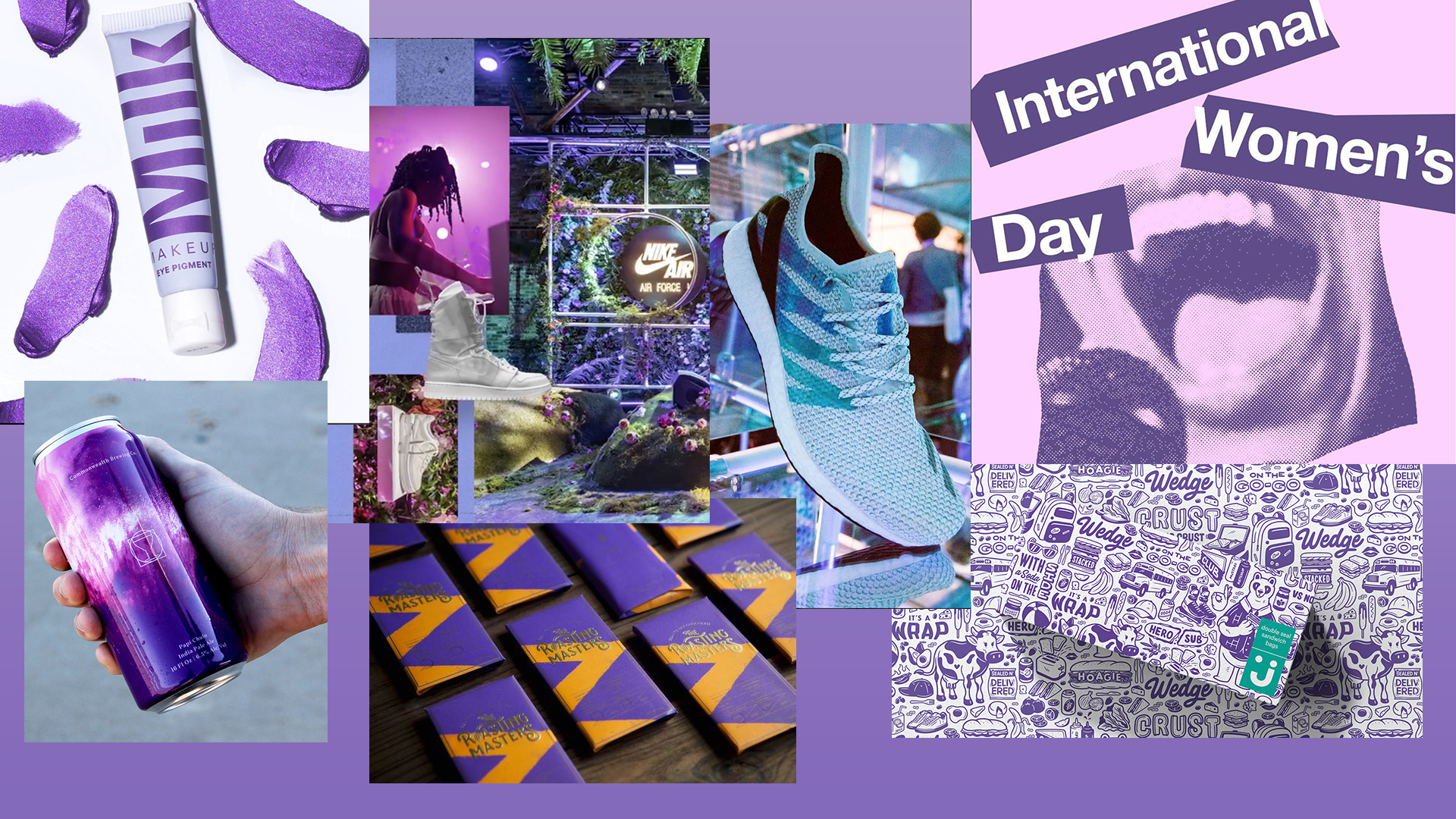
Creatives are loving the Ultraviolet trend by utilizing it in photos, print, and interior design. Brands are embracing the extravagance of Ultraviolet through light design in advertising campaigns, as well as in packaging and product design itself.
Do you think this color is a passing fad or here to stay? Let us know!
Posted in: Uncategorized
Leave a Comment (0) ↓